By C.J. Bunce
Geoff Johns is well known as one of DC’s best writers and he doesn’t disappoint with a well formed intro to everyone’s favorite superhero from their youth.
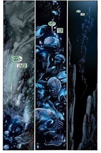
Ivan Reis’s pencilling of the king of Atlantis is clean. He has a nice way of making Aquaman look like a hero in contrast to the regular people he encounters around Boston Harbor. A few pages feel bit like Reis could go in the direction of the Aspen/Fathom art style. He doesn’t and I am not sure if that would be so bad. Here is the original art for his first appearance in the DC New 52:
I was a bit surprised to see a brooding Aquaman. The story begins with an awakening of some hideous sea monsters at the bottom of the ocean’s depths. By the end of the book the creatures have reached the water’s surface and had their first and unfortunate contact with humans. Like several other DC New 52 stories, this Aquaman is having some sort of mid-life crisis and a re-evaluation of his role as superhero of Atlantis. (Makes you wonder how all these writers are doing in their personal lives just a little bit).
Some nice setting locations go a long way to getting us into the feel for this book: a seafood restaurant, a lighthouse where Aquaman’s alias Arthur lives with a beautiful wife, and a seaworn vessel where the crew is first to encounter the sea monsters.
The sea monsters are probably the best villains yet in the DC’s New 52. Alien-like, with their own language, these will be a good first nemesis for Aquaman.
As new costumes go Aquaman looks exactly like he should. His gold scaled shirt seems to shine as if made from gold, matching his trident. At first we see Aquaman in a fish out of water scene and he is tough, with bullet deflection and the ability to make a car stop with his trident.
This would be a great first comic for all ages, and I am looking forward to issue #2.


[…] Aquaman […]